
What is a landing page, and why does it matter?
A landing page is a focused page built for a single goal, usually the page someone arrives on after clicking an ad, email or search result. Unlike a homepage, which serves many audiences and purposes, a landing page has one job: convert that specific visitor into a lead or sale.
That focus is exactly why landing pages matter so much. Sending paid or campaign traffic to a general homepage wastes clicks, because the visitor has to hunt for what they came for. A dedicated page that matches the promise that brought them there converts far more of the same traffic, which is why landing pages are central to conversion rate optimisation.
What are the core elements of a high-converting page?
Most high-converting landing pages share the same building blocks:
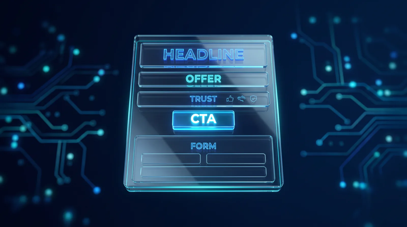
- A clear, benefit-led headline that instantly says what you offer and why it matters
- A strong, specific offer that gives the visitor a reason to act now
- Trust signals: reviews, testimonials, results, guarantees and recognisable clients
- A single, focused call to action, repeated, with no competing distractions
- A short, easy form or an obvious next step
The theme running through all of these is clarity and focus. Every element should push the visitor towards the one action you want, and anything that does not is a candidate for removal.
How important is the message match?
It is one of the biggest levers and one of the most overlooked. Message match means the landing page delivers exactly what the ad, email or search result promised. If someone clicks an ad for "emergency boiler repair" and lands on a generic heating homepage, they bounce.
When the headline and offer mirror the promise that brought the visitor in, they feel reassured they are in the right place and are far more likely to continue. Strong message match is often the difference between a page that wastes ad spend and one that converts it, and it costs nothing but attention to get right.
What kills landing page conversions?
A few common mistakes quietly drain results: too many competing calls to action, so the visitor does not know what to do; long or intrusive forms that ask for more than necessary; slow load times, especially on mobile; walls of text with no clear structure; and a lack of trust signals.
Distraction is the underlying enemy. Navigation menus, multiple offers and unnecessary links all give the visitor a way to leave without converting. A high-converting page is disciplined: it removes anything that does not serve the single goal. Speed matters too, since a slow page loses visitors before they even read the offer.

Does the page need to work on mobile?
Absolutely, and for most campaigns mobile is the majority of traffic. A landing page must load fast, read clearly and let people complete the action easily on a small screen, with tappable buttons and short forms.
Many pages that convert well on desktop fail on mobile because the layout is cramped, the form is fiddly or the page is slow. Designing mobile-first, and testing the whole journey on a phone, prevents you from losing most of your visitors at the final step. If mobile conversions lag desktop badly, that gap is usually the quickest win available.
How do you keep improving a landing page?
The best landing pages are not written once and left; they are tested and refined. Use A/B testing to compare versions of headlines, offers, layouts and calls to action, and let real visitor behaviour, not opinion, decide what works.
Also watch how people actually use the page with analytics and heatmaps to see where they hesitate or drop off, then fix those points. Small, evidence-based improvements compound into big gains over time. This continuous cycle of testing and refining is the core of conversion rate optimisation, and it is how a decent page becomes a great one, and how you push past a merely average conversion rate.